
Choosing Website Colors
More Than Pretty Hues: How to Strategically Choose Your Website's Brand Colors
Ever landed on a website and instantly felt a certain way – calm, excited, professional, or perhaps a little overwhelmed? A huge part of that subconscious reaction comes down to color. Your website's brand colors are far more than just a pretty aesthetic; they're a powerful communication tool that can influence how visitors perceive your brand, evoke emotions, and even drive conversions.
But with an entire rainbow at your disposal, how do you even begin to choose? Don't worry, you don't need to be a design expert to make impactful decisions. This post will walk you through a strategic approach to selecting brand colors that truly resonate with your audience and amplify your brand message.
Why Do Brand Colors Matter So Much?
Before we dive into the "how," let's quickly re-emphasize the "why":
First Impressions are Everything: Colors are often the first thing people notice and remember about your brand.
Emotional Connection: Different colors evoke different emotions and associations. Using them strategically can create the desired feeling in your audience.
Brand Recognition & Recall: Consistent use of your brand colors helps with memorability and makes your brand instantly recognizable.
Conveying Your Message: Colors can communicate your brand's personality, values, and industry niche without a single word.
Guiding User Experience: Colors can highlight important information, create visual hierarchy, and guide users through your website.
Beyond "I Like Blue": A Strategic Approach to Color Selection
So, how do you move past personal preference and choose colors that work hard for your brand?
1. Understand Your Brand Identity (The Foundation)
This is the most crucial first step. Before you even look at a color wheel, you need to have a crystal-clear understanding of:
Your Brand's Personality: Are you playful and energetic? Serious and authoritative? Calm and trustworthy? Innovative and cutting-edge?
Your Target Audience: Who are you trying to reach? What are their demographics, psychographics, and cultural associations with colors? (e.g., bright colors might appeal to a younger audience, while more muted tones could resonate with a luxury market).
Your Brand Values: What do you stand for? (e.g., sustainability, innovation, community, luxury, affordability).
Your Industry: While not a strict rule, certain industries tend to lean towards particular color palettes (e.g., finance often uses blues and greens, tech might use modern brights).
Action Step: Brainstorm 3-5 adjectives that describe your brand. This will be your compass.
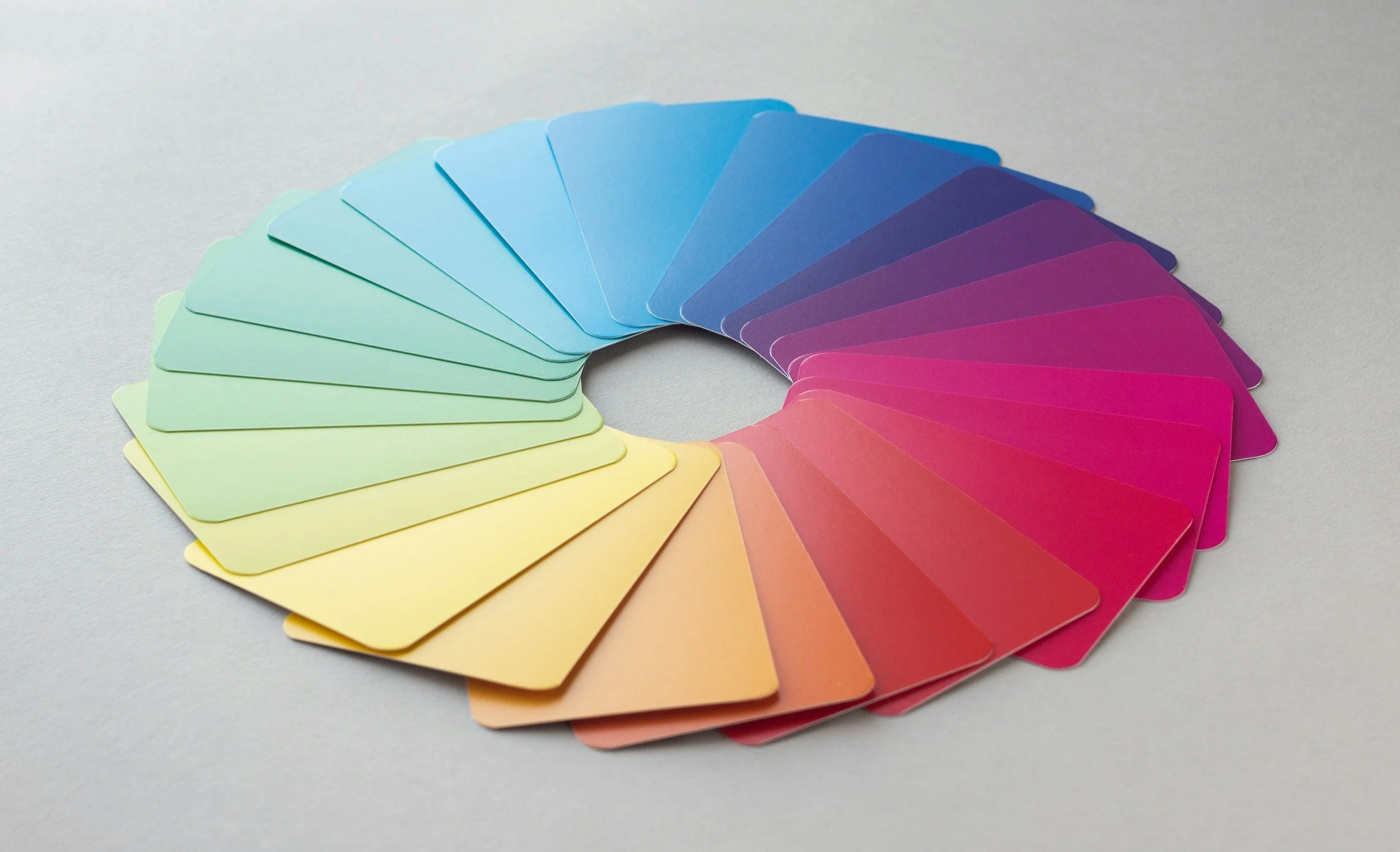
2. Explore Color Psychology (The Emotional Impact)
This is where it gets fascinating! Different colors have widely accepted psychological associations. While these can vary culturally, here's a general overview:
Red: Passion, energy, excitement, urgency, danger, love.
Orange: Enthusiasm, creativity, warmth, friendliness, affordability.
Yellow: Happiness, optimism, joy, warning, intellectual.
Green: Nature, growth, harmony, health, wealth, stability.
Blue: Trust, tranquility, stability, professionalism, intelligence, reliability.
Purple: Luxury, creativity, royalty, spirituality, wisdom.
Pink: Femininity, sweetness, romance, playfulness.
Brown: Earthiness, reliability, warmth, ruggedness.
Black: Sophistication, power, elegance, formality, mystery.
White: Purity, simplicity, cleanliness, modernity.
Gray: Neutrality, balance, sophistication, formality.
Action Step: Consider which emotions you want your website visitors to feel and how different colors align with your brand adjectives.
3. Analyze Your Competition (Learn & Differentiate)
Take a look at your competitors' websites.
What colors are they using? Are there common themes?
How do their colors make you feel?
How can you differentiate yourself through color? You don't want to blend in; you want to stand out, even subtly.
Action Step: Make a list of your top 3-5 competitors and note their primary brand colors.
4. Build Your Color Palette (The Art & Science)
Now it's time to bring it all together. A typical website color palette includes:
Primary Colors (1-2): These are your dominant colors, representing your core brand. They'll be used for headings, calls to action, and significant branding elements.
Secondary Colors (2-3): These support your primary colors, adding variety and visual interest. They can be used for subheadings, backgrounds, or complementary elements.
Accent Colors (1-2): Often bright and bold, these are used sparingly to draw attention to specific elements like buttons, links, or important icons.
Neutral Colors (Grays, Whites, Blacks): Essential for providing contrast, readability, and a clean aesthetic. These are your foundational background and text colors.
Tips for Building Your Palette:
Start with one strong primary color that perfectly embodies your brand.
Use a color wheel and color scheme generators (e.g., Adobe Color, Coolors.co) to find harmonious combinations (monochromatic, analogous, complementary, triadic). These tools can be incredibly helpful.
Consider accessibility. Ensure enough contrast between text and background colors for readability, especially for users with visual impairments.
Test, Test, Test! Apply your chosen colors to mockups of your website. See how they look together. Do they feel right? Are they easy on the eyes?
5. Consistency is Key
Once you've chosen your brand colors, stick to them! Use them consistently across your website, social media, marketing materials, and any other brand touchpoints. This consistency builds recognition, trust, and a cohesive brand image.
Final Thoughts: Don't Overthink It, But Do Think Strategically
Choosing your website's brand colors can feel like a big decision, and it is! But by approaching it strategically, understanding your brand, and leveraging the power of color psychology, you can create a visual identity that not only looks great but also effectively communicates your message and connects with your audience.
Gemini assisted writing.